Reviews Widget
Product reviews play a crucial role in online purchasing decisions. This case study examines the challenges of our existing review widget, which was underperforming in terms of user engagement and conversion. Our goal was to redesign the widget to improve user trust, provide more valuable information to potential customers, and ultimately drive sales.
Discovery and Research
Research Goals:
- Gain a deeper understanding of the review business
- Identify the key features typically offered in review systems
- Gather functional inspiration for implementing these features effectively
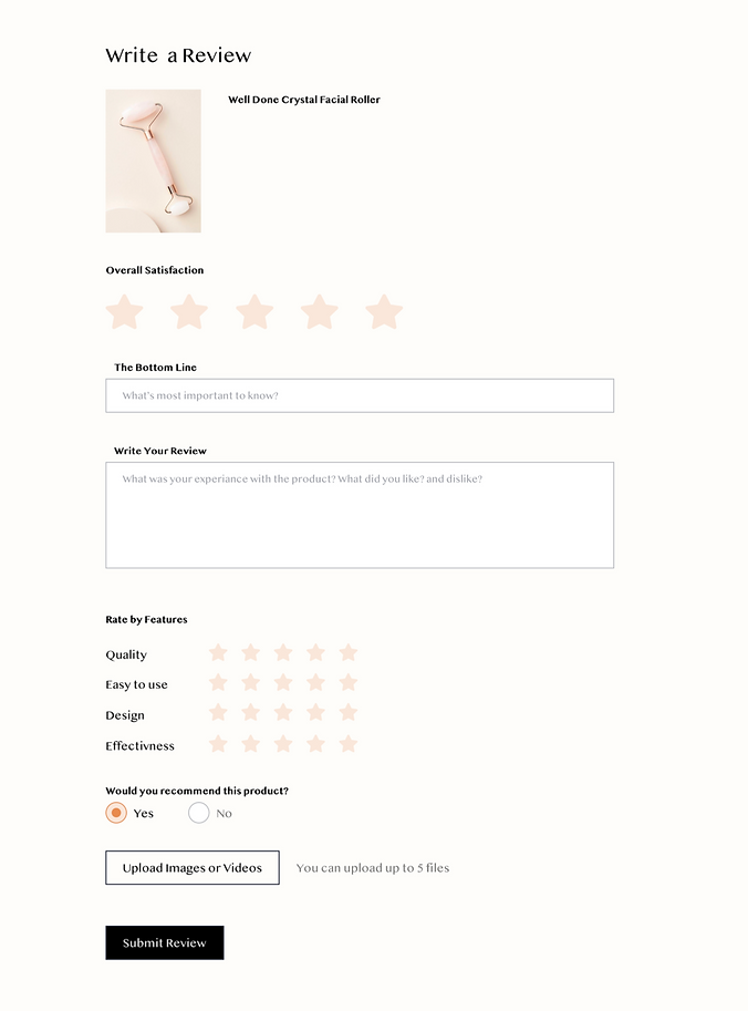
I looked at both the reviews feed and the submission form.
Business Analysis
For my benchmark research, I focused on leading online retailers. I started by exploring major e-commerce platforms such as Amazon, AliExpress, Etsy, and Walmart. To gain a broader perspective, I expanded my research to other industries, looking at vacation and leisure sites like Booking.com and Google Maps.
I conducted a comparative analysis to identify patterns, consistencies, and best practices across these platforms. To do this, I mapped the relevant pages by components, allowing me to better understand how these sites approach reviews and user interactions.
**Early on in my research I realized that Google maps and Booking are not very insightful to me. Google maps form and feed were too lean and I was not able to get to the Write a review page on booking but reviewing the Reviews feed I concluded that there was no news there.
Reviews feed

Submission Form

Analysis & Insights

Most of the features were consistent across all four platforms.
Based on this, I decided to include these common features in the default view of my review widget, while the features that weren't present across all platforms would be configurable. The layout of the reviews section and individual review posts varied across platforms, with all but Amazon stacking features vertically.
I particularly liked Amazon's approach, where the overall rating was placed in a separate left column and the individual reviews were aligned to the right. This layout helped maintain a comfortable line width for the review text. However, the vertical stacking approach used by the other platforms made the content more scannable and well-organized. Given that three out of four platforms used this approach, I decided to adopt it as the default for the widget.
The layout for individual review posts varied slightly. I don't see any clear advantages or disadvantages to either approach—it's more about personal preference and hierarchy. With this in mind, I thought it would be useful to offer a few layout presets within the widget, allowing users to choose the one that best aligns with their vision.
The "helpful" component was present across all platforms. Amazon displayed helpfulness statistics, while Walmart rated all comments and highlighted the most helpful ones. AliExpress and Etsy inquired about helpfulness, but this information wasn’t visible anywhere (unlike on Amazon and Walmart, where it was either used as a sorting category or displayed as the top helpful reviews).
I also observed some complexity in the process of submitting a review.
There was a noticeable correlation between the "verified purchase" status and the entry point for submitting a review. When users accessed the review form from "My Orders," the "verified purchase" badge was not shown, and vice versa, which made sense from a functional perspective.
In terms of UI design, I recognized that these platforms essentially use templates. I focused on keeping my design minimalistic to allow for easy customization and quick adaptation.
The Sunny Day

Visual Concept & Design